Back to All Projects
The scope of this project entails enhancing both the design and usability of the candidate report page. This improvement involves featuring key metrics prominently at the top of the page, ensuring that they are immediately visible without the need for scrolling. The primary goal of this enhancement is to provide administrators with a clear and concise overview of a candidate’s performance, enabling them to quickly grasp and assess the candidate’s overall performance and suitability for a position.
Client
HackerEarth
Service Provided
Research, User Interviews, UX/UI Design, Prototype
Duration
8 Weeks


The Goal:
The objective was to enhance the usability of Hackerearth's candidate report page by improving its design and functionality. The focus was on making the report more intuitive, insightful, and efficient for administrators to assess candidate performance.
The Challenge:
Several challenges had to be addressed, including balancing information clarity and density to prevent cognitive overload while ensuring essential details were easily accessible. Identifying and prioritizing key metrics for immediate visibility was crucial. The design needed to be responsive across different devices, maintain consistency with the existing UI, and ensure performance optimization without slowing down load times. Additionally, cognitive load management was necessary to present information in a structured and comprehensible manner.
The Results:
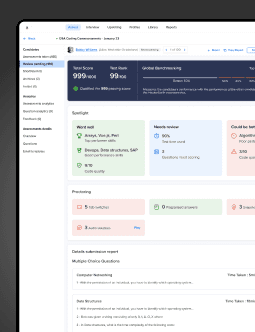
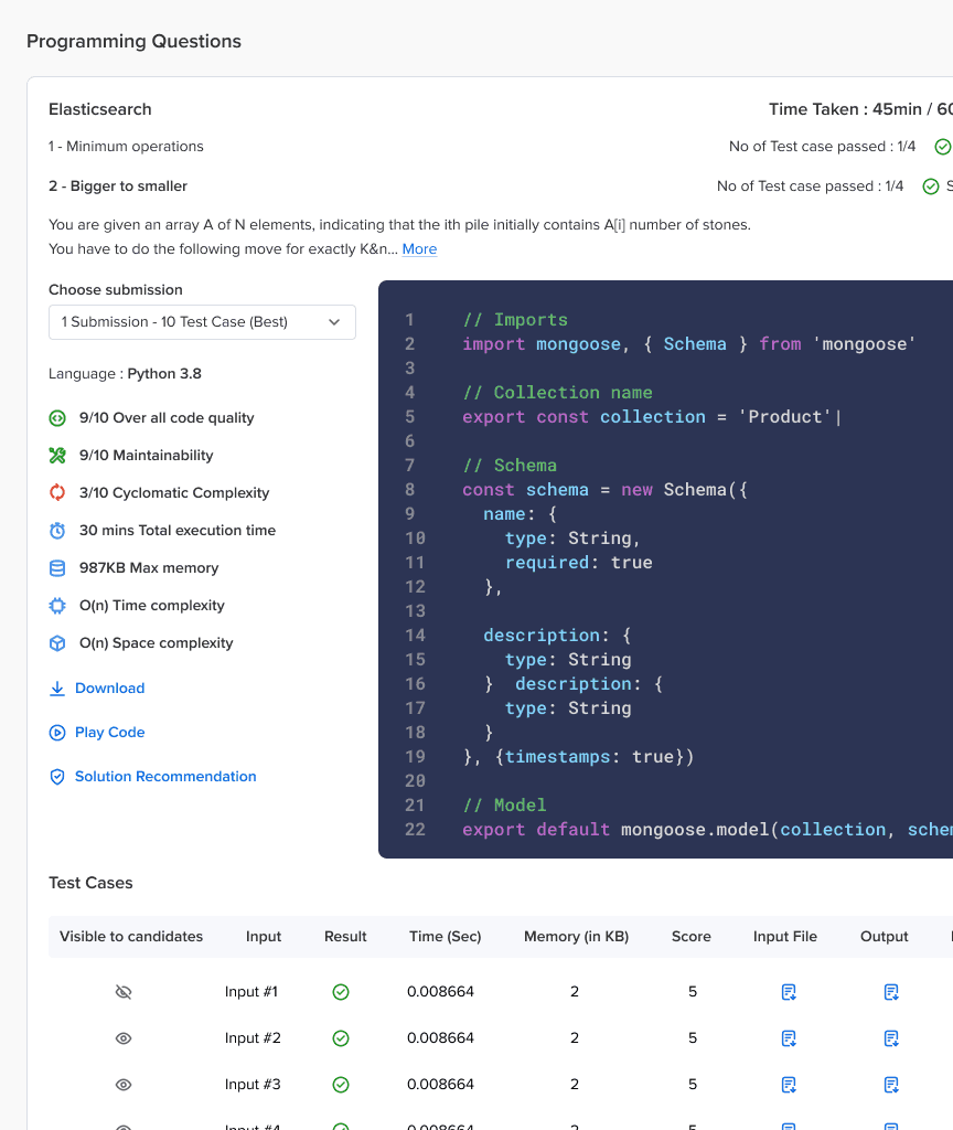
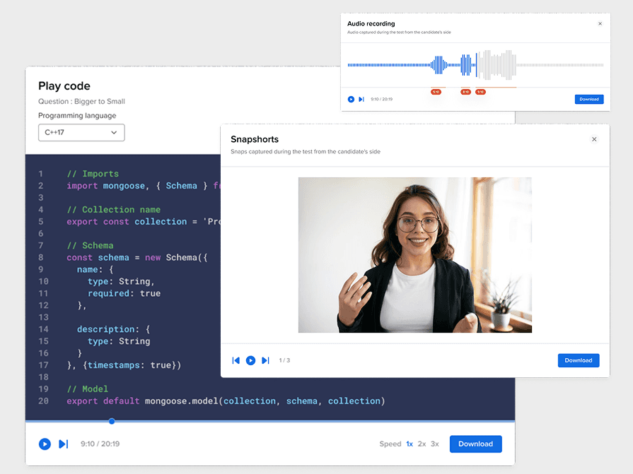
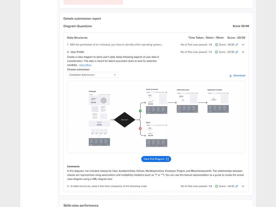
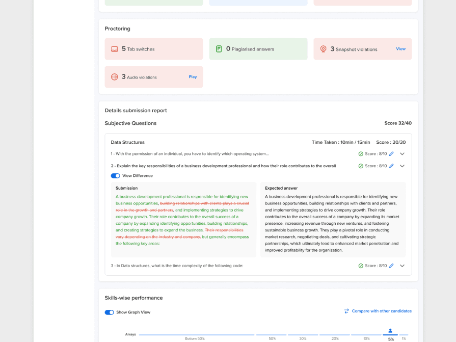
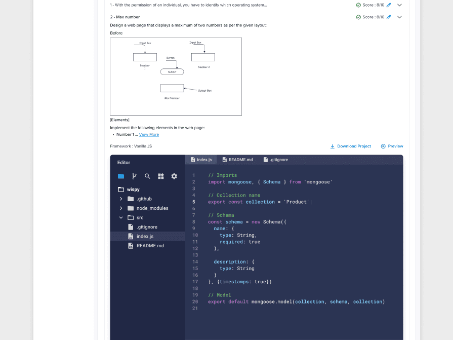
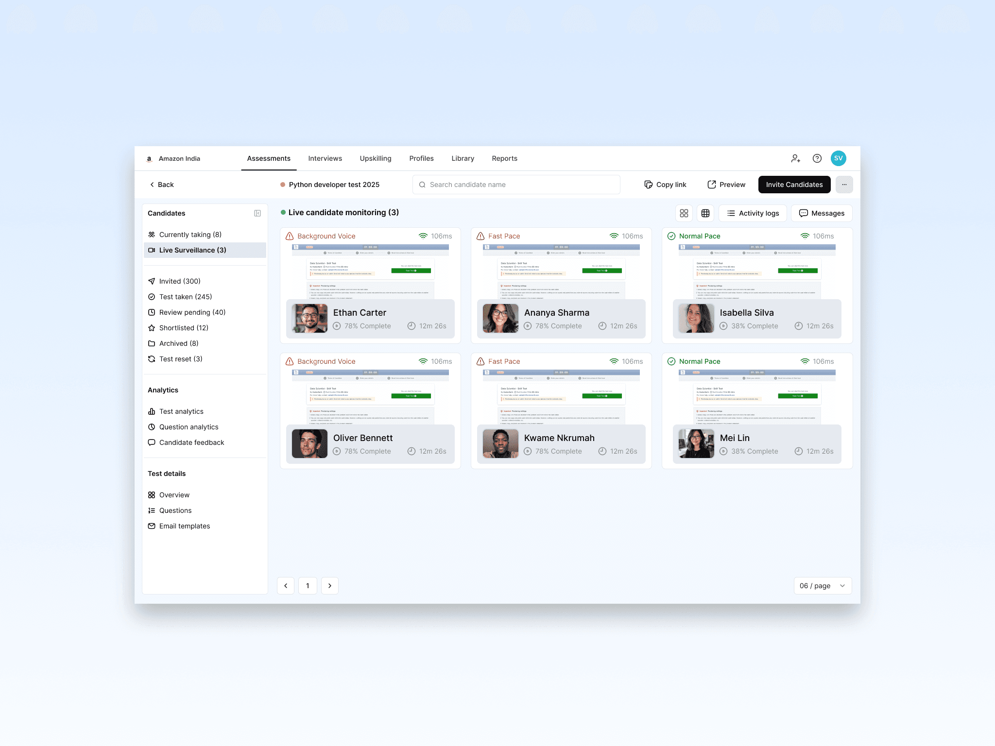
To improve usability, a sticky header was implemented to display essential candidate details, ensuring context remained visible while navigating. Key performance metrics, such as total score, test rank, and global benchmarks, were prominently placed for quick assessment. Performance spotlight sections were introduced to categorize candidate strengths and weaknesses, allowing administrators to assess results efficiently. A dedicated proctoring insights section was added to detect any dishonest practices, and a review question functionality enabled recruiters to manually evaluate and score individual responses. These enhancements collectively streamlined the assessment process, making it more effective and user-friendly.
Other Projects We Worked On.

Only 2 Spots Left - Starts at $3k/month
Partner with Us and Elevate Your Business to New Heights!
Suited for businesses seeking strategic design & ideas, paired with the expertise of a senior designer.